On-Going Live Service App (2023-2025)
VirtualSpeech APP.
Virtualspeech is a training app for professional development that uses E-Learning, Generative AI, Virtual Reality, and Mixed Reality. I was brought on as their UI/UX designer to redesign the app to improve user experience, content organization, and data visualization on all platforms.

All Designs, wireframes and in Engine Development including Animations/Assets are created by myself
including Company Videos, Trailer and Company Branded Collateral.
FRONT END.
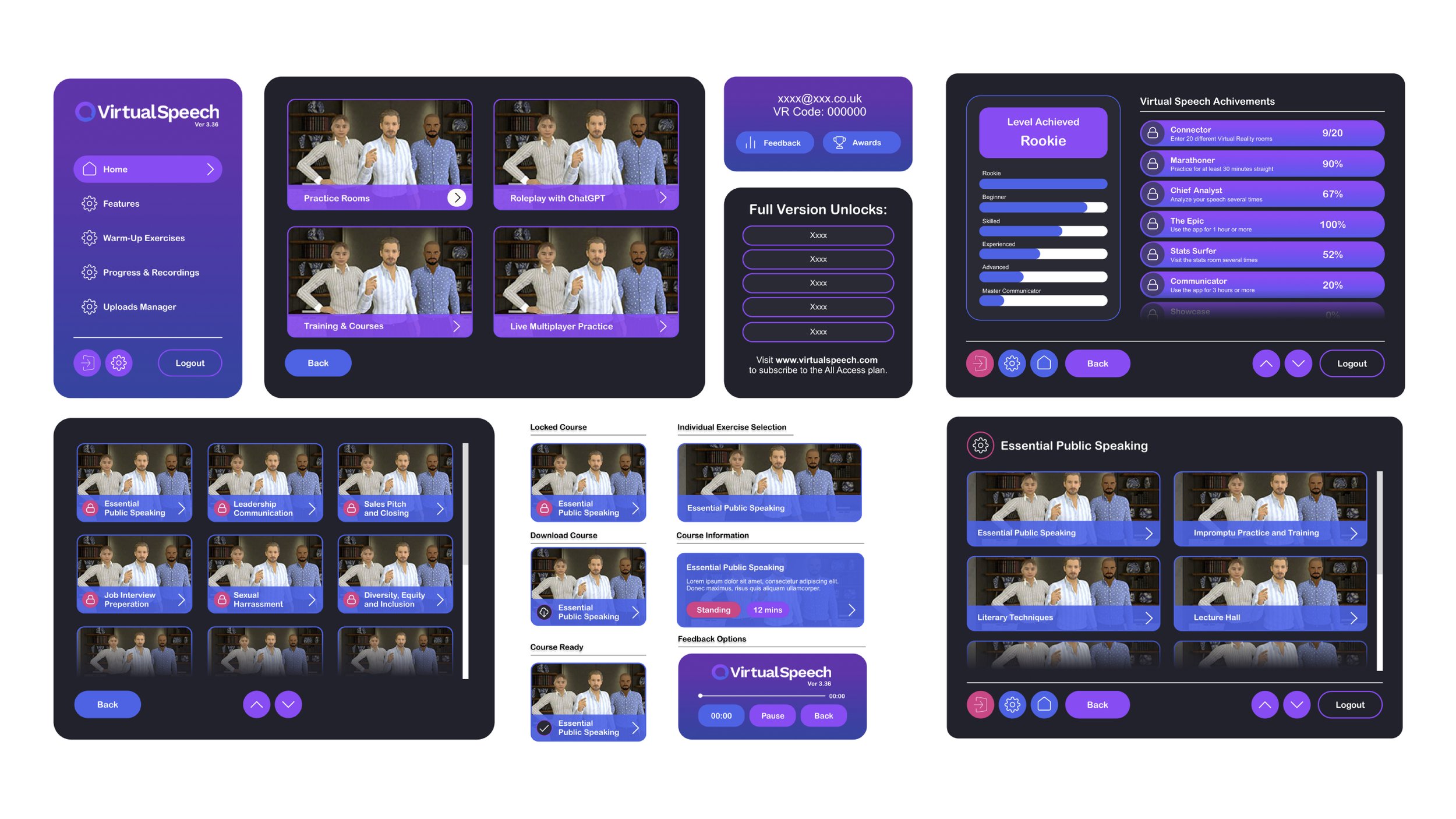
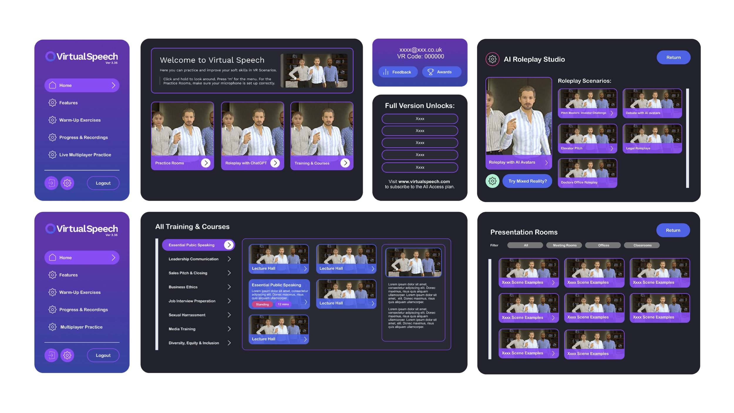
INTRODUCING THE APP
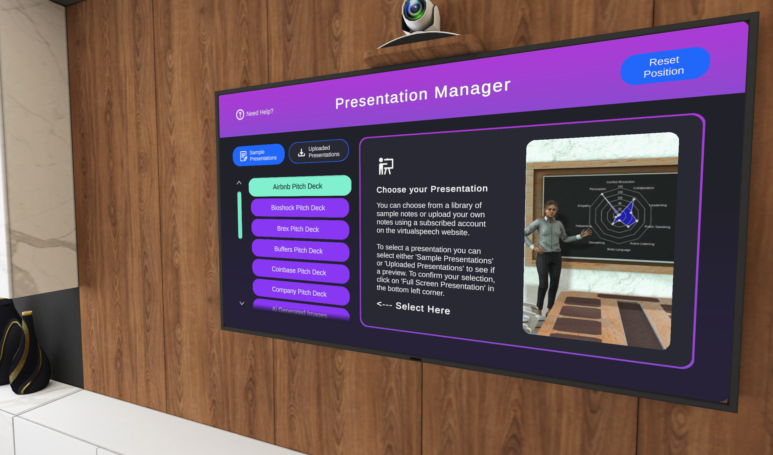
I started with the app's main menu, which has many e-learning courses that need better organization. My aim was to make it easier for users to find what they want with fewer clicks while keeping a friendly and modern look for the XR platform.

CONCEPTS
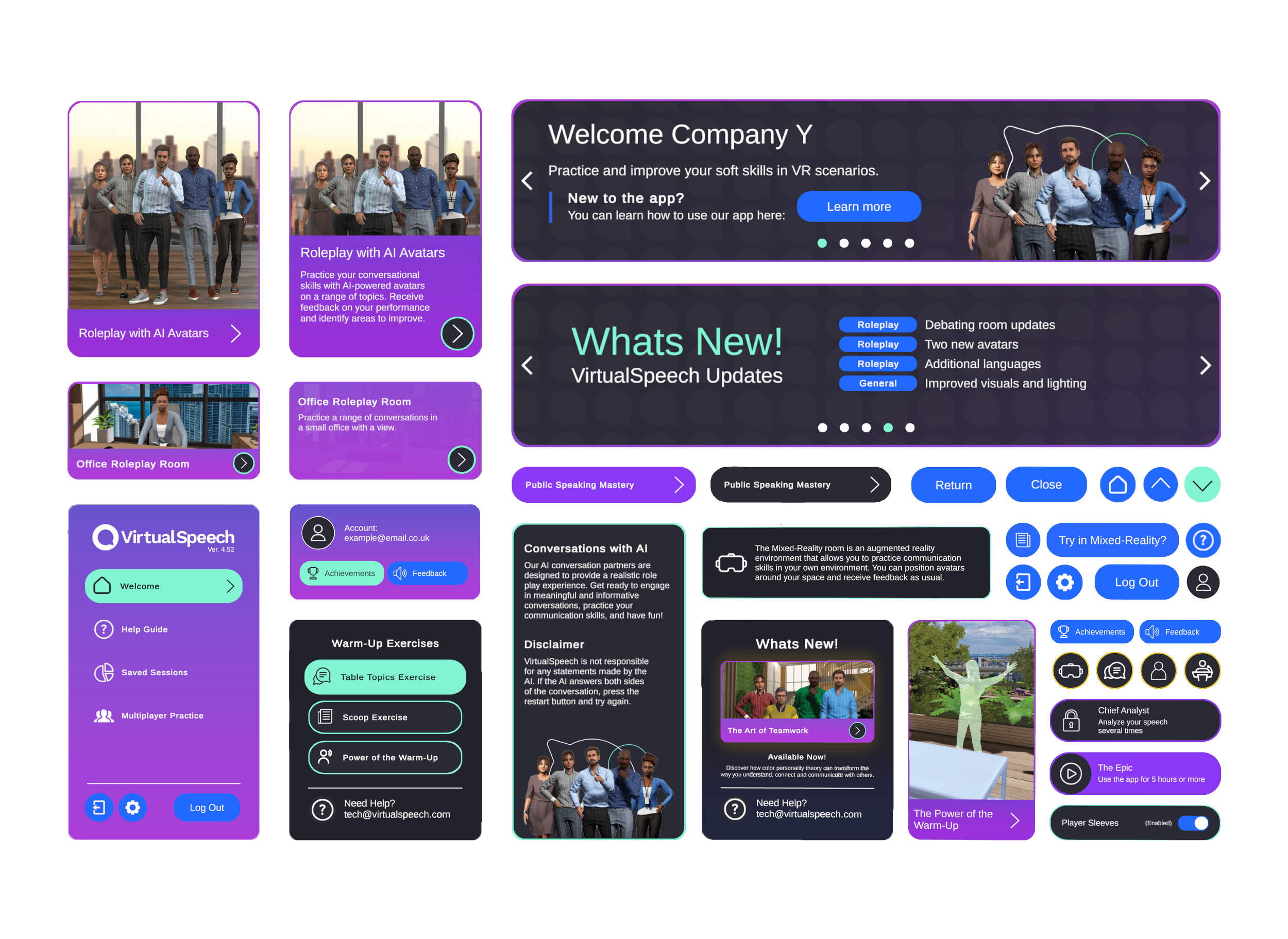
When I started at the company, I made the brand guidelines and updated the style and design of the main menu. I developed several concepts and ideas. The initial layout and content were mostly fixed, but I had some leeway with the brand colors. I concentrated on arranging the important content and flow.
[Designed in Figma]
-
Initially, there was no dedicated designer on our team, which meant that there were no established brand guidelines or predefined color palettes to follow. Faced with this challenge, I took it upon myself to create an entirely new and cohesive look for both the company and the app. My design approach primarily involved using a harmonious mix of vibrant purple and pink hues, complemented by a subtle blue to enhance navigation and interactions within the platform.
-
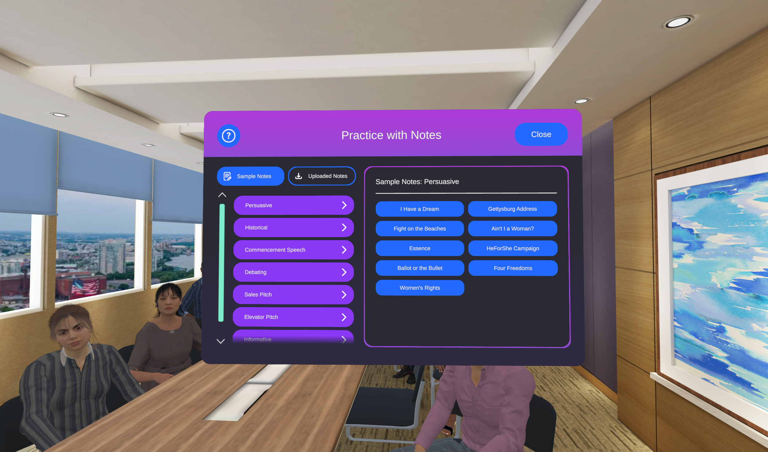
VirtualSpeech provides more than 15 courses, each featuring a mix of exercises and content. These courses include sections like ‘AI Roleplays,’ ‘Practice Rooms,’ and scripted e-learning. I created a main navigation on the left, with primary sections on the cover and sub-content within those sections, creating a clear content hierarchy.
-
The original app design had the developers preferring all content visible at once instead of using scrolls, which I knew was unrealistic. To keep this idea, I focused on making it easy for users to access different menu items, ensuring most content was just 2-3 clicks away.
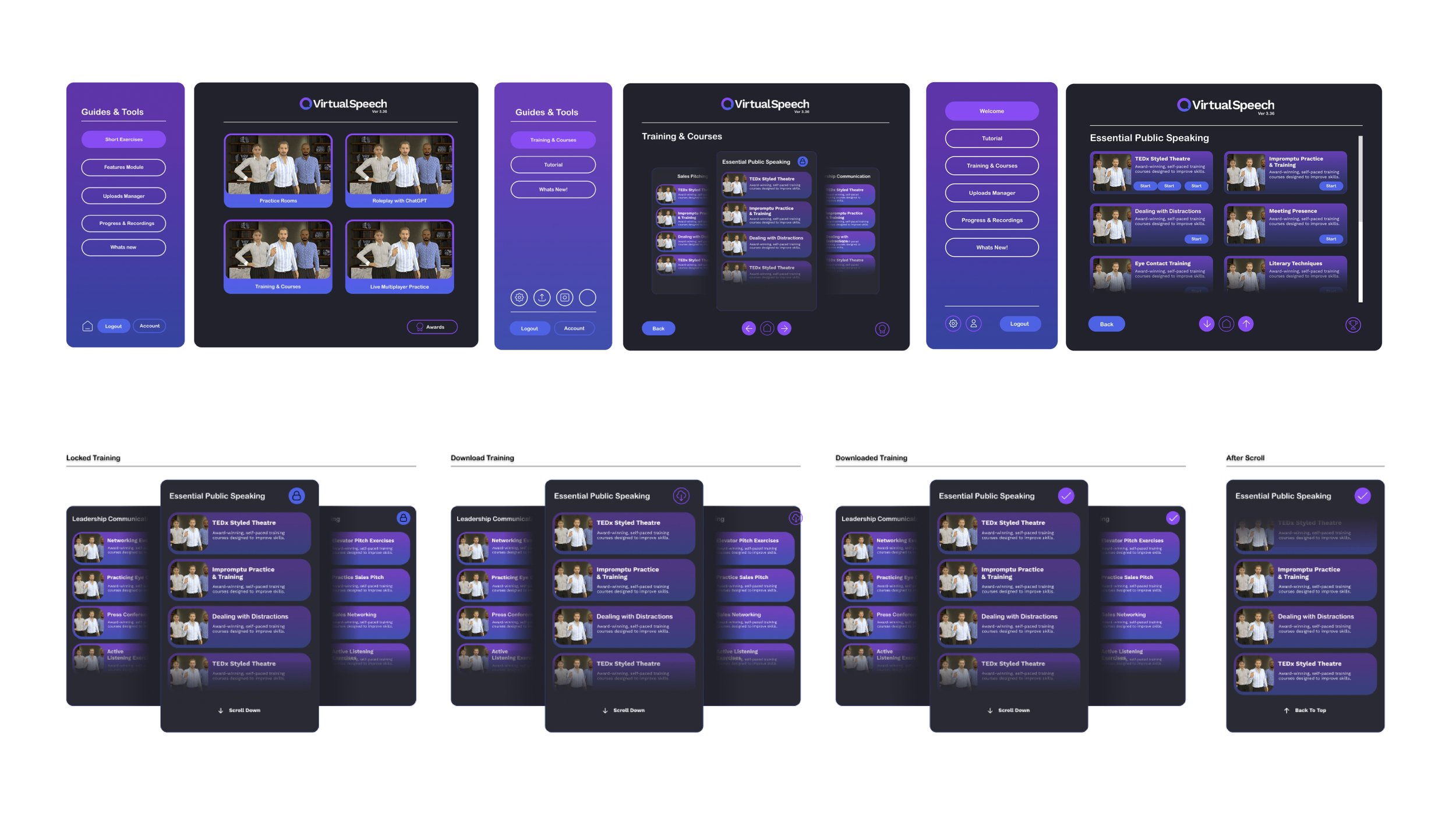
Initial concept draft features a main navigation panel and a secondary one on the left. Users can swipe through sections to view courses and exercises, organized with courses on the left/right and sub-courses on top/bottom.
The second concept has three sections: one for accounts, one for news, and one for additional information. This version will also be more stable, allowing users to scroll through content sections to show more courses and exercises at once.
The third idea seeks to enlarge the content display, allowing more information on screen at once. It incorporates accounts/logos and personalization on the left navigation panel, adjusting sizes based on content importance.
WireframES
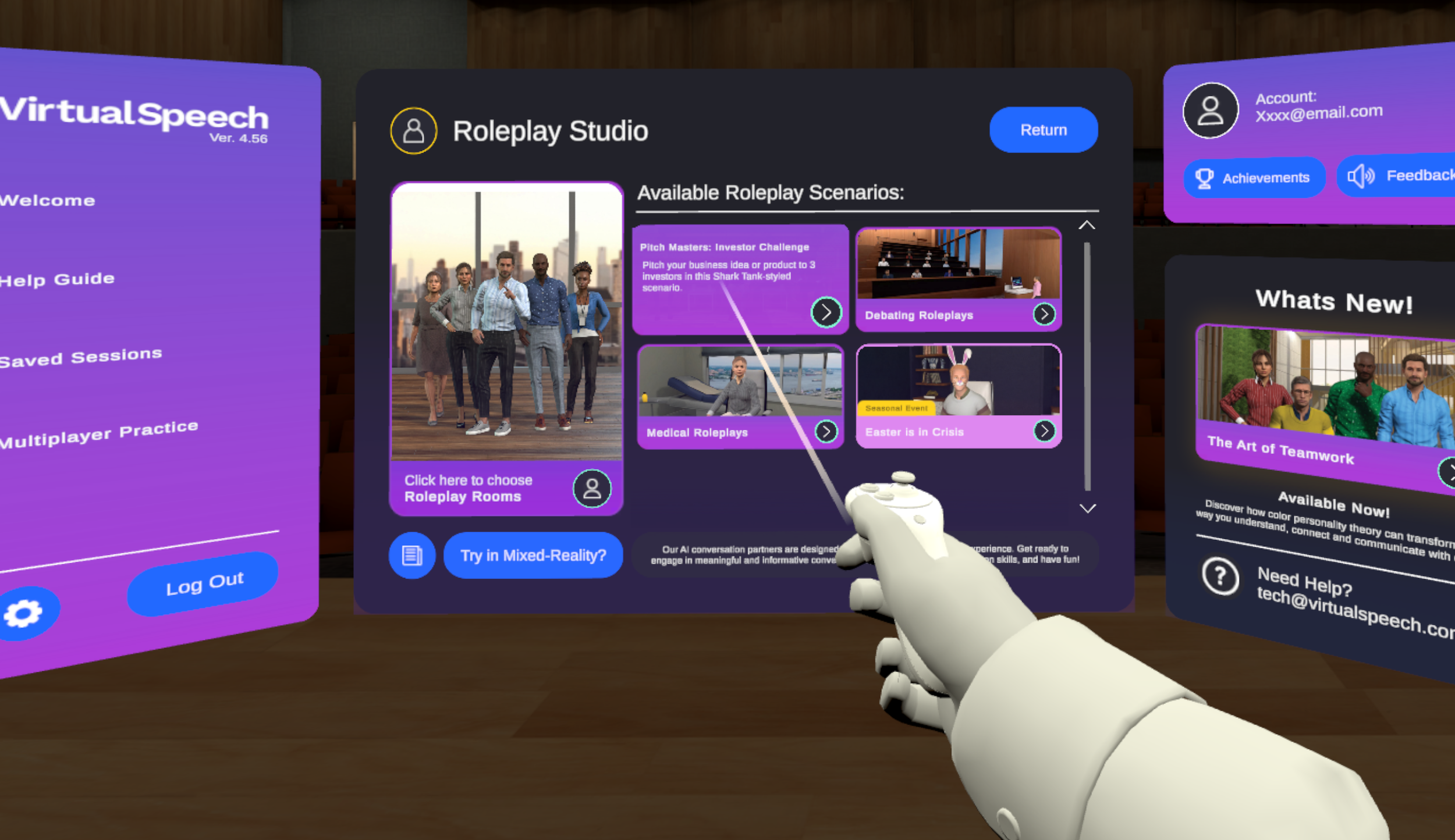
After the initial ideas were approved, I quickly started planning the scale, layout, and wireframes for the Unity project. The team discussed much of the content verbally, taking inspiration from the app's earlier structure. This teamwork aimed to ensure a smooth transition while improving user experience and functionality.
[Built in Figma]
-
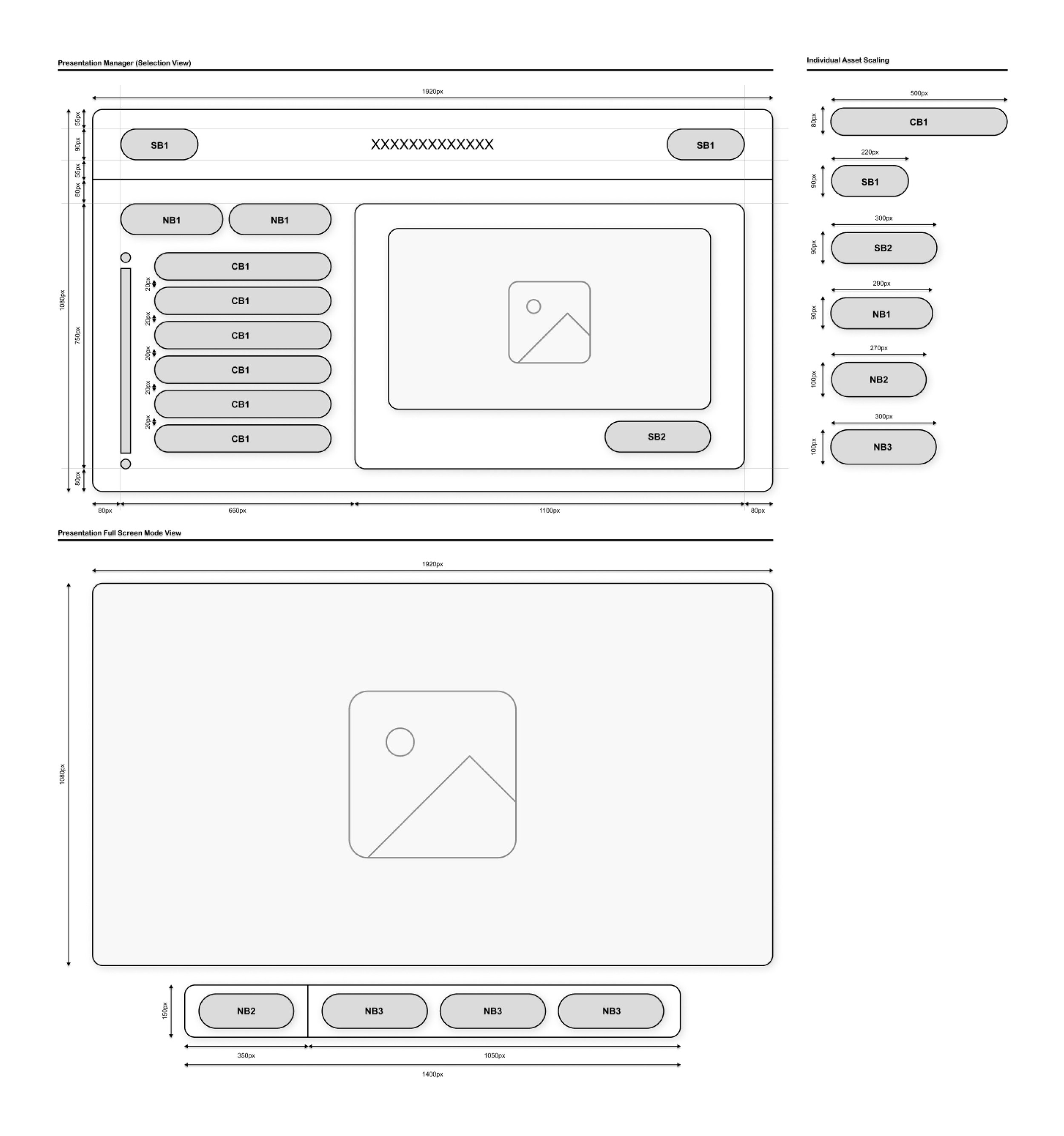
Finding the right size for 3D assets while ensuring readability was challenging. We set distance rules and examined close-up interactions. I decided everything should remain within 2 meters of the player, as most controls use point-and-click. User interfaces will generally be in HD format (1920×1080 pixels), with some exceptions based on the scene.
-
The app's technical limits, due to a small development team, prevent custom sizing for the player. We use standard height settings based on the device for accessibility. Most of the app has the user sitting, keeping elements within 2 meters of their head. If the player moves and resets in the headset, the interface adjusts to the new position.
-
Most course content currently uses point-and-click features, limiting physical interaction. Players must maintain a 2-meter distance for clarity and accessibility, but improvements are planned for the future.
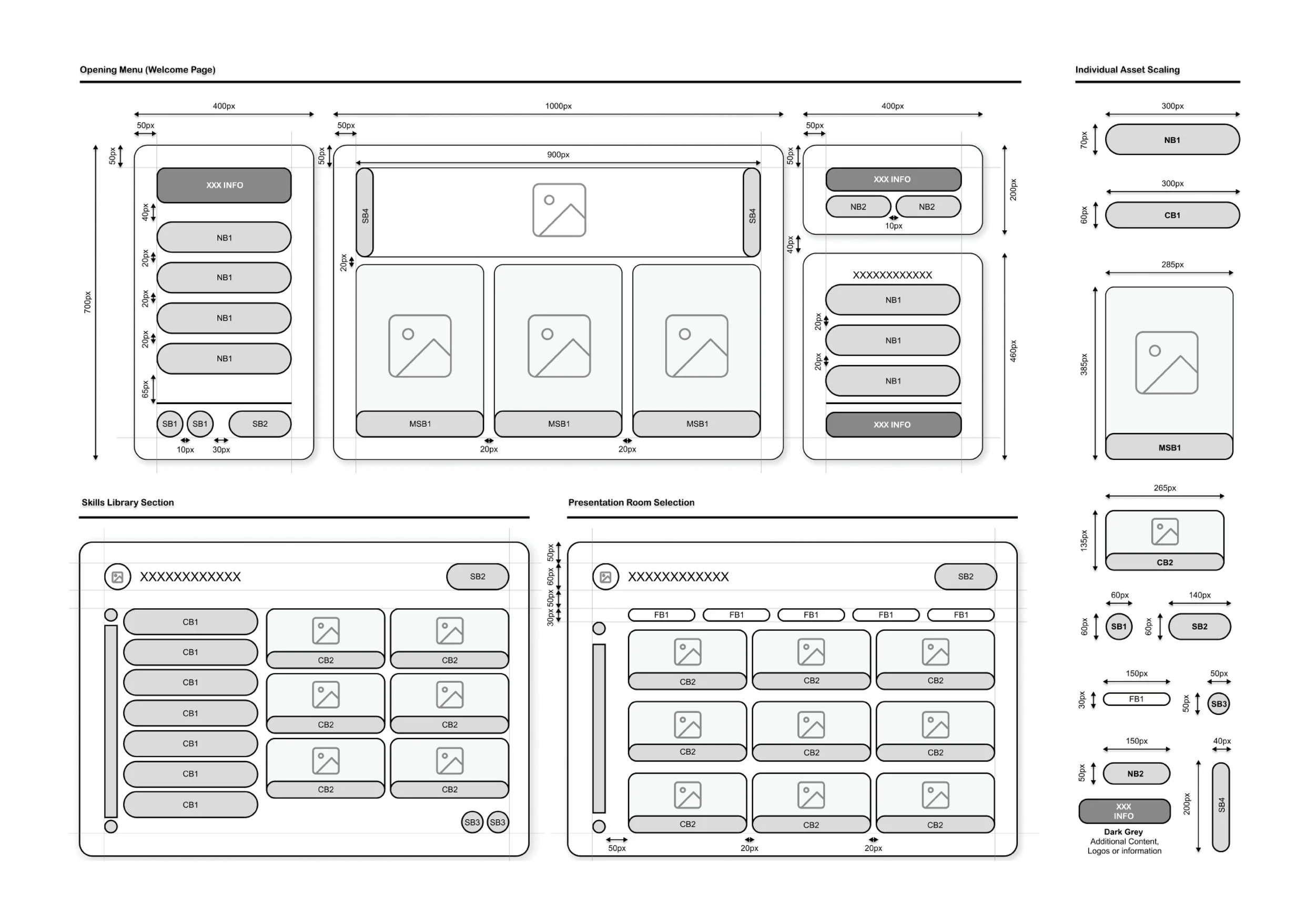
ELEMENTS
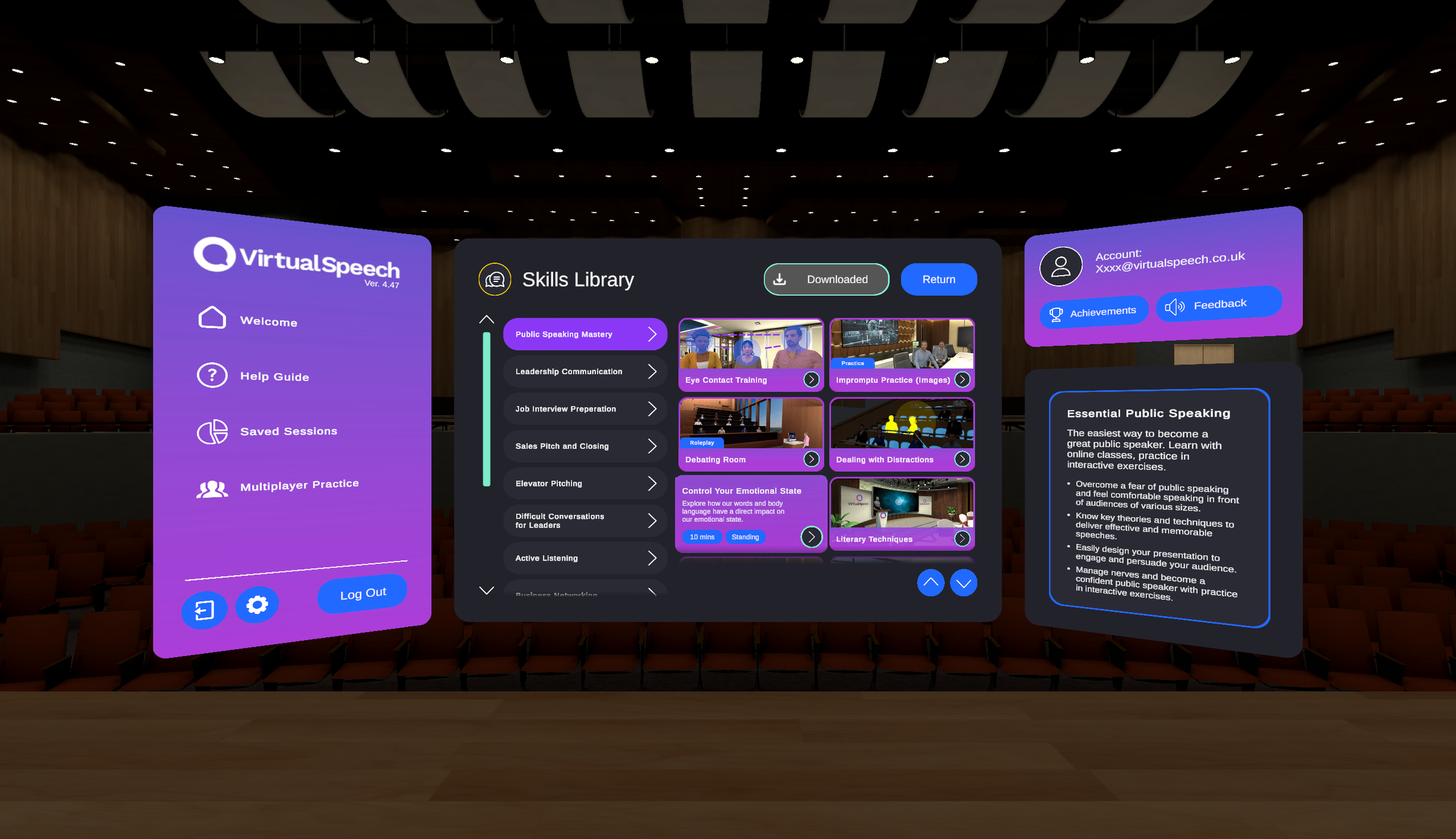
After the concepts were approved for development, I focused on creating the scaling, layout, and wireframes needed for the Unity project. This step was crucial for starting to build in the editor, ensuring a smooth workflow.
[Built in Unity]
-
All elements were made as prefabs that could be used in different scenes and parts of the app with only small custom changes needed in some areas.
-
To prevent problems with prefabs, all elements were made separately and only changed if they showed similarities; otherwise, new elements and animations were created from the beginning.
-
All elements needed extensive user testing to understand how users respond to them. We evaluated various factors, including colors, icons, text readability, and animation speeds throughout the app's development.


VR HUD/OVERLAYS.
ENVIRONMENTAL PLAYER UI
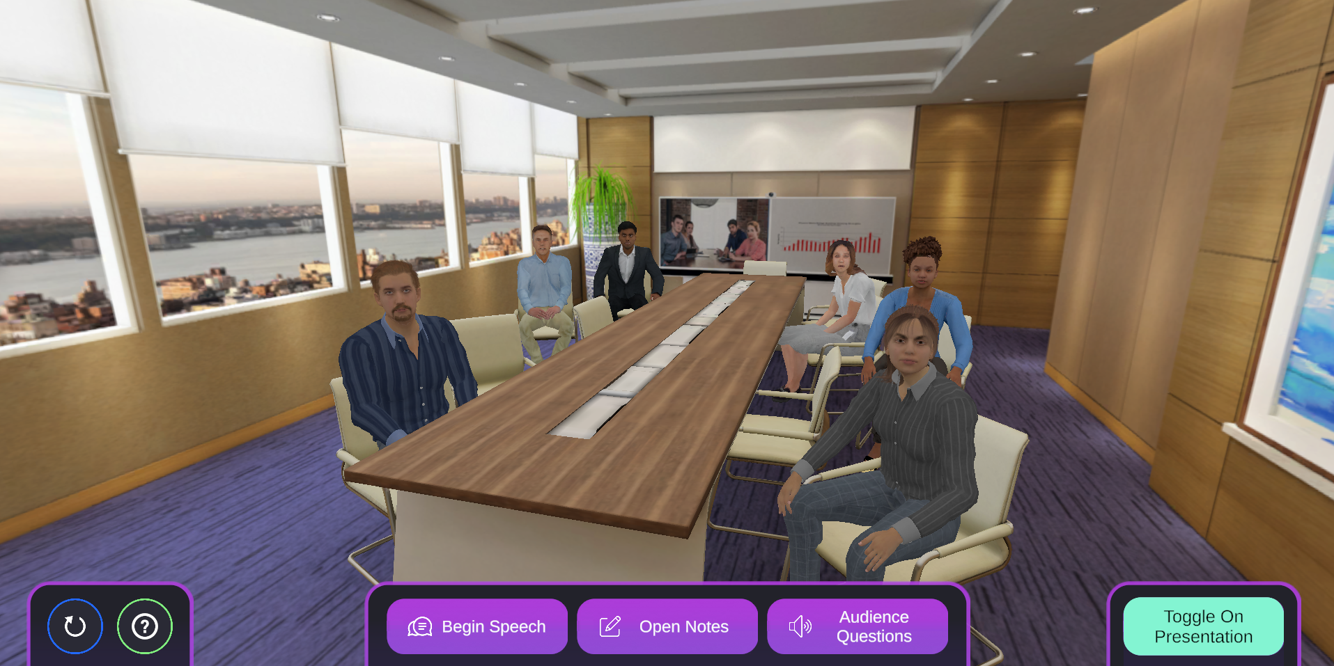
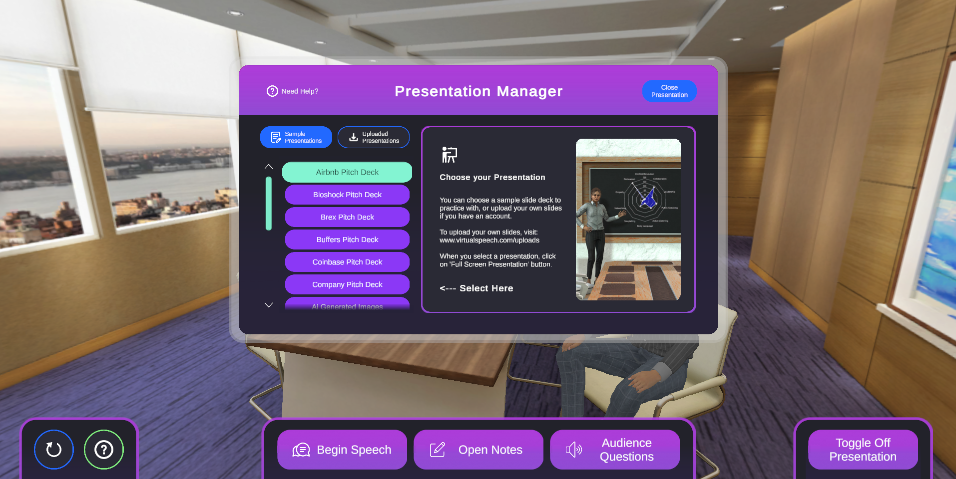
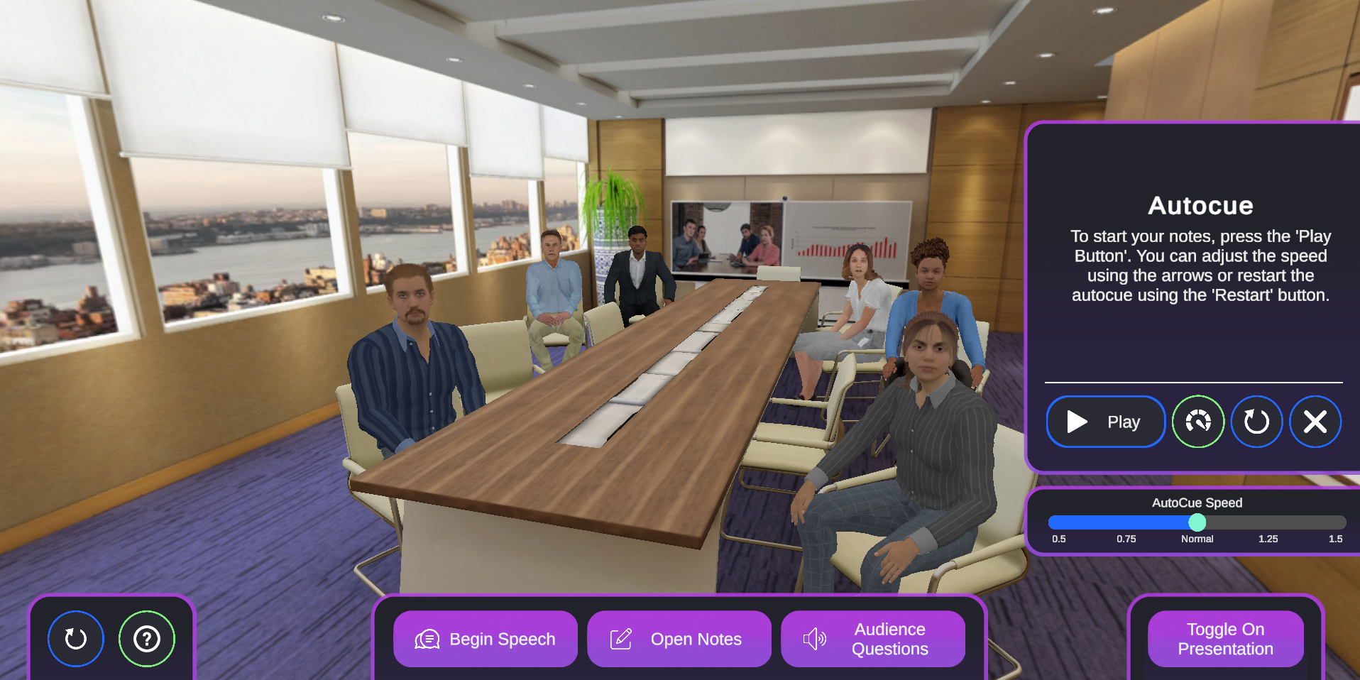
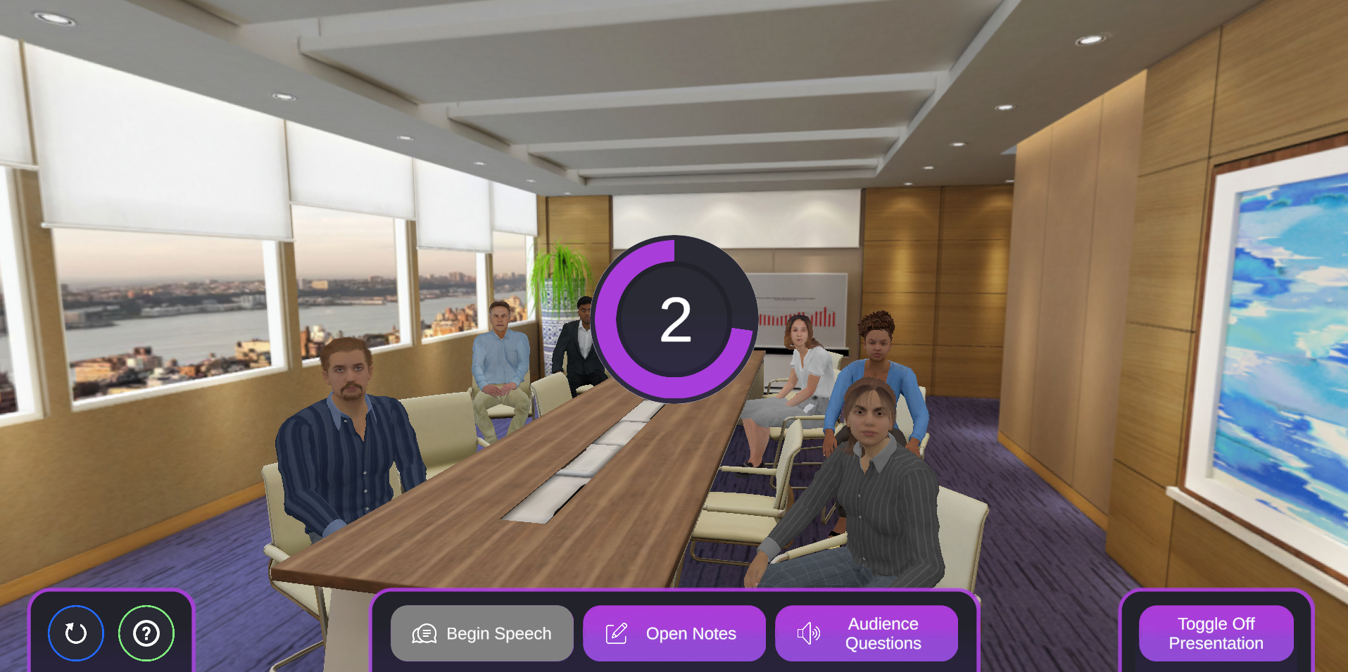
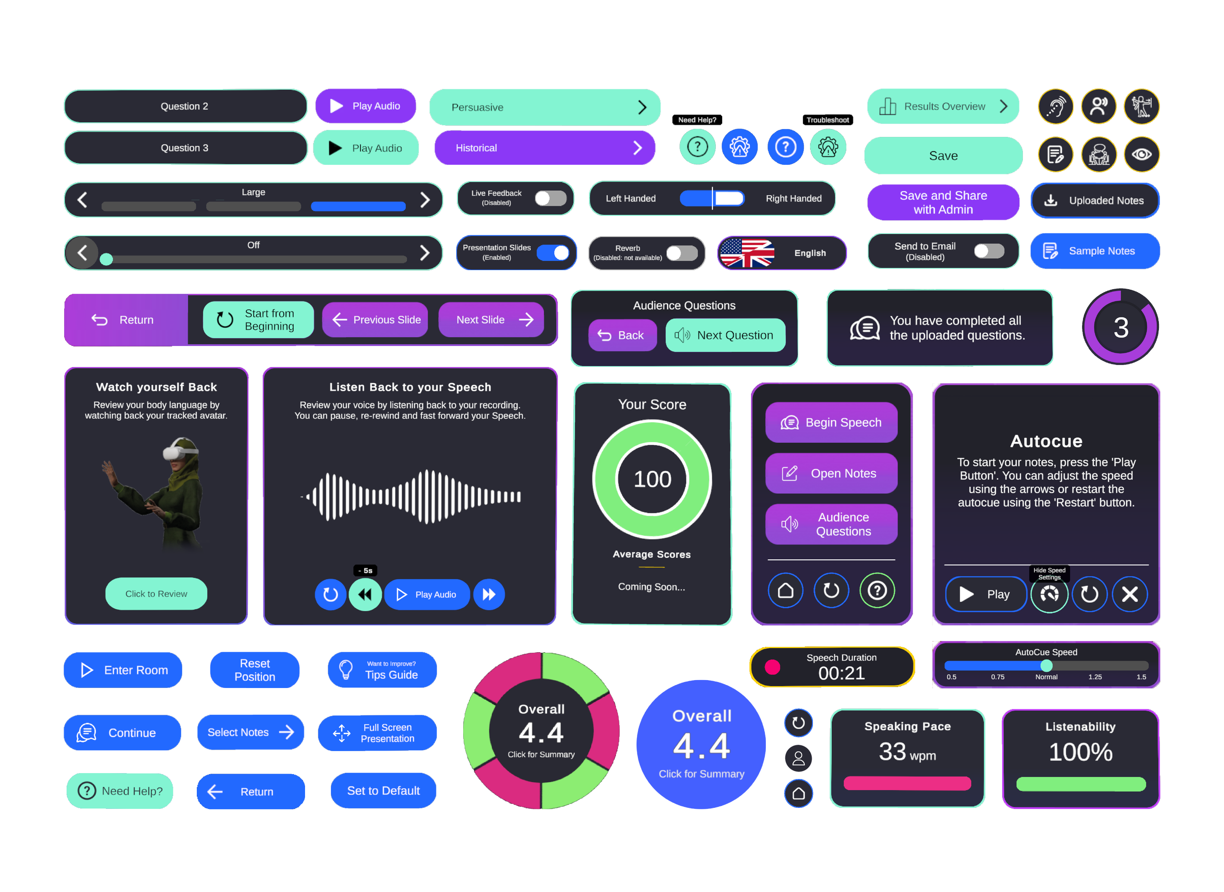
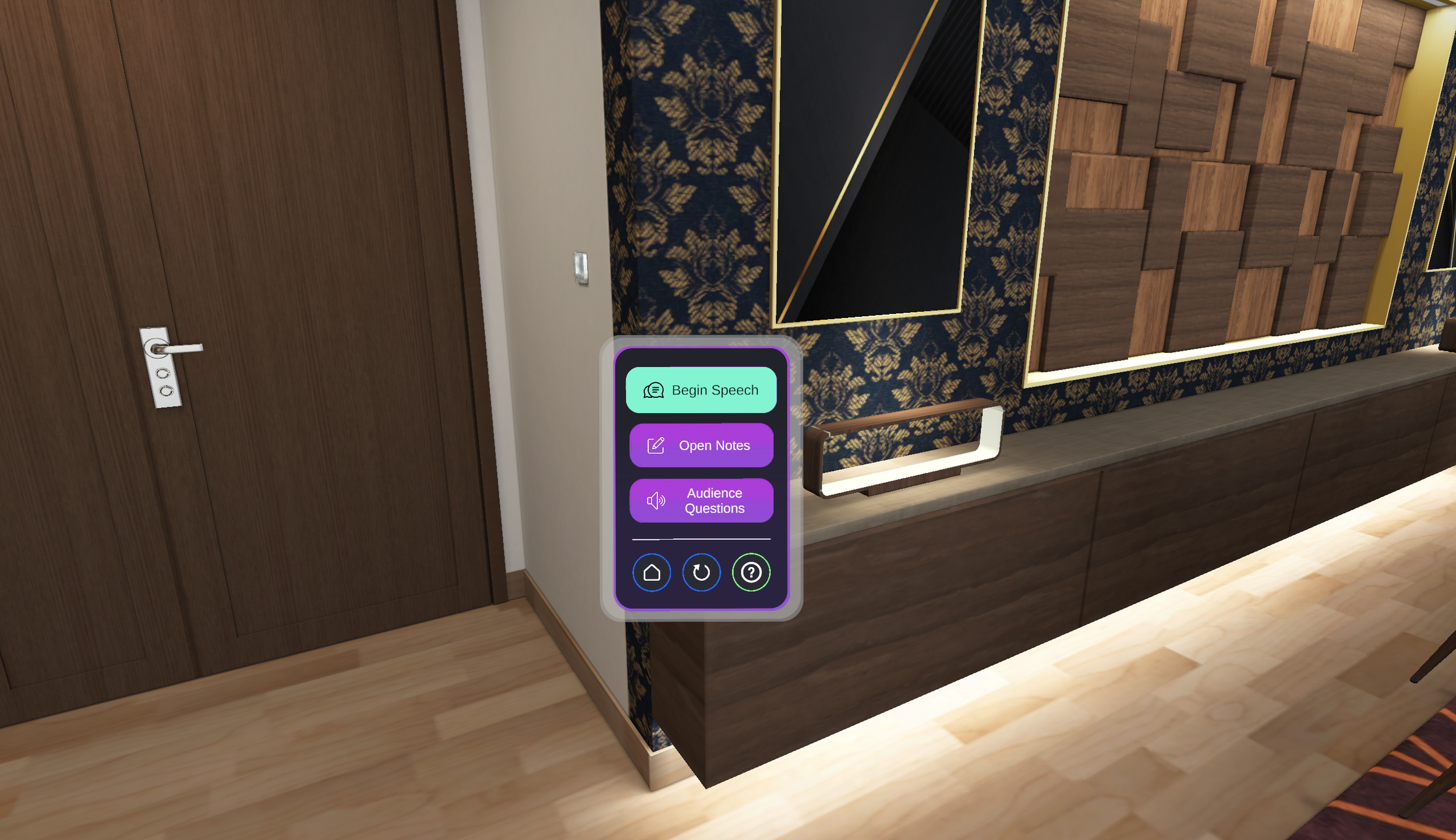
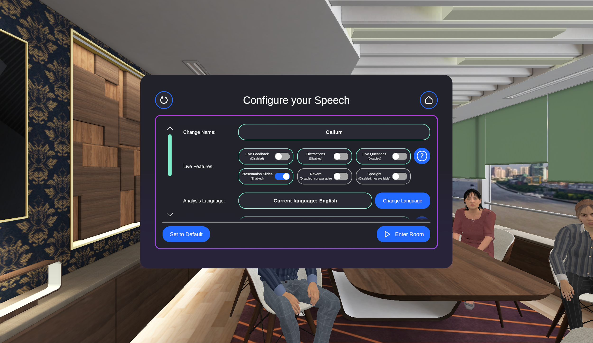
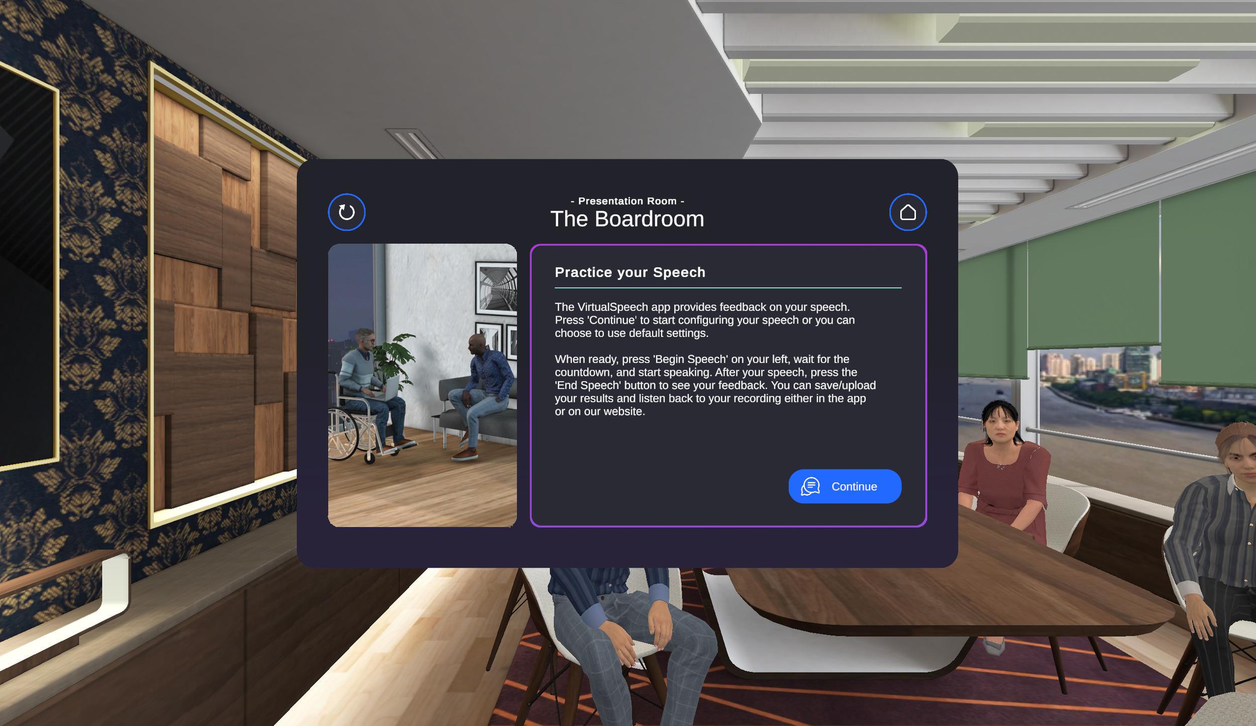
After completing the main menu, I aimed to improve gameplay and user experience in the practice rooms. Initially, the setup was inflexible, with mixed styles and unclear instructions. My goals were to introduce new branding, organize content better, add user-friendly features, create help guides, enable a movable interface, and present clearer results with improved visuals.
Click Play to See Live ———>

WireframES
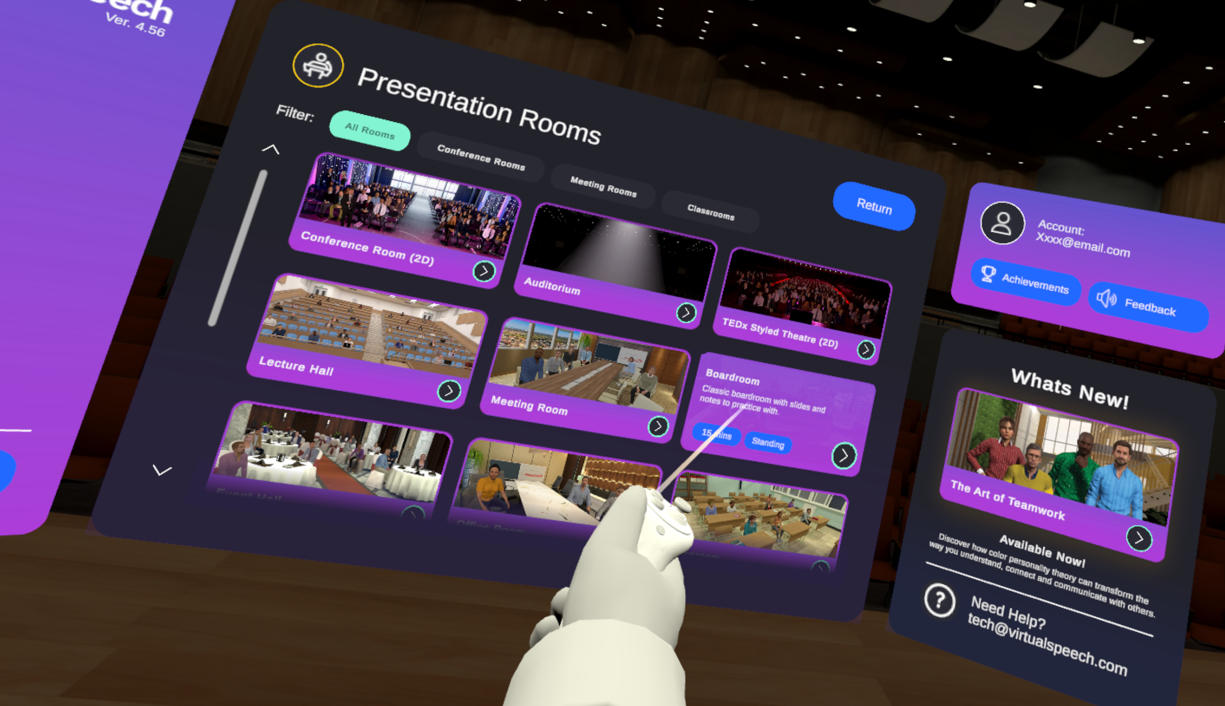
The design was updated for a consistent look across the app based on the main menu. Next, we needed to determine the best way to show content, display scores, organize tools, and other key elements. I understood this would take more time, need careful user testing, and involve multiple revisions with our clients.
-
I wanted to ensure that all UI elements are sized consistently, that content is easy to read, and that all created elements and interfaces can be used throughout the app with the same rules for player distance and interaction reach.
-
I wanted to ensure that the app is easy to use, allowing one-handed use with simple point-and-click actions.
-
Most of the app uses a 2D interface, but some parts include 3D models. These models are layered over sections of the app to make the user feel more immersed in the environment, with certain features connecting to others based on their purpose.


Browser Adaptaion.
VR IN YOUR BROWSER (WEBGL)
VirtualSpeech offers a 'VR in your browser' option, allowing most of the VR app to run online using 'WebGL.' This needed all existing systems, assets, and user interfaces to be modified for mouse and keyboard use.